CHALLENGE: Create a brand for an abandoned fort turned luxury hotel, catering to a wealthy demographic that loves culture and history and is looking for unique, vivid, and memorable experiences.
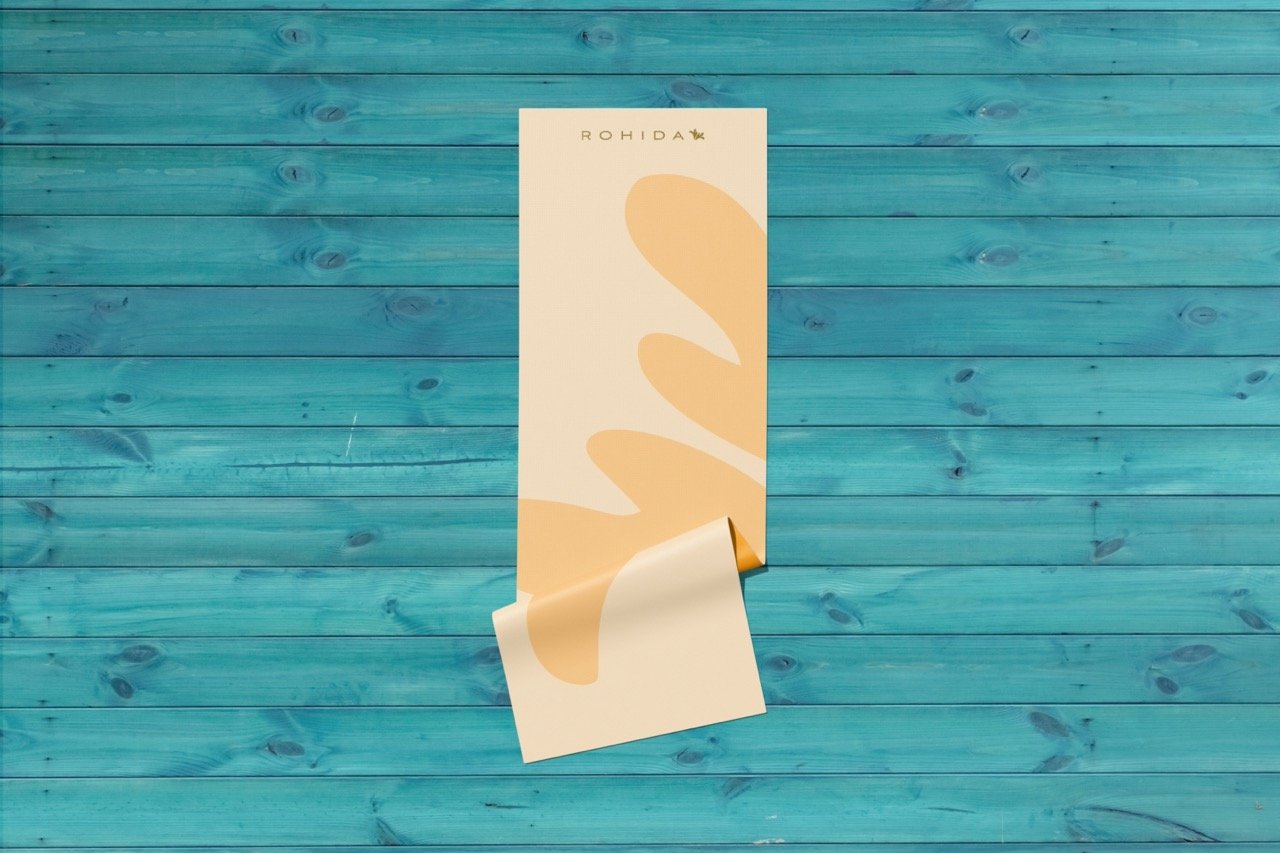
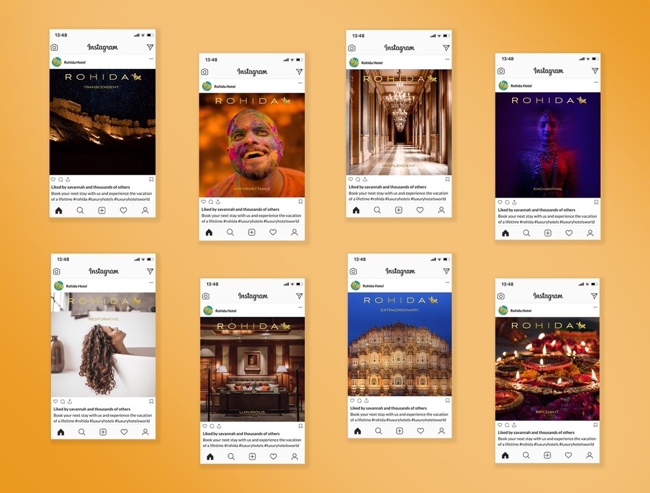
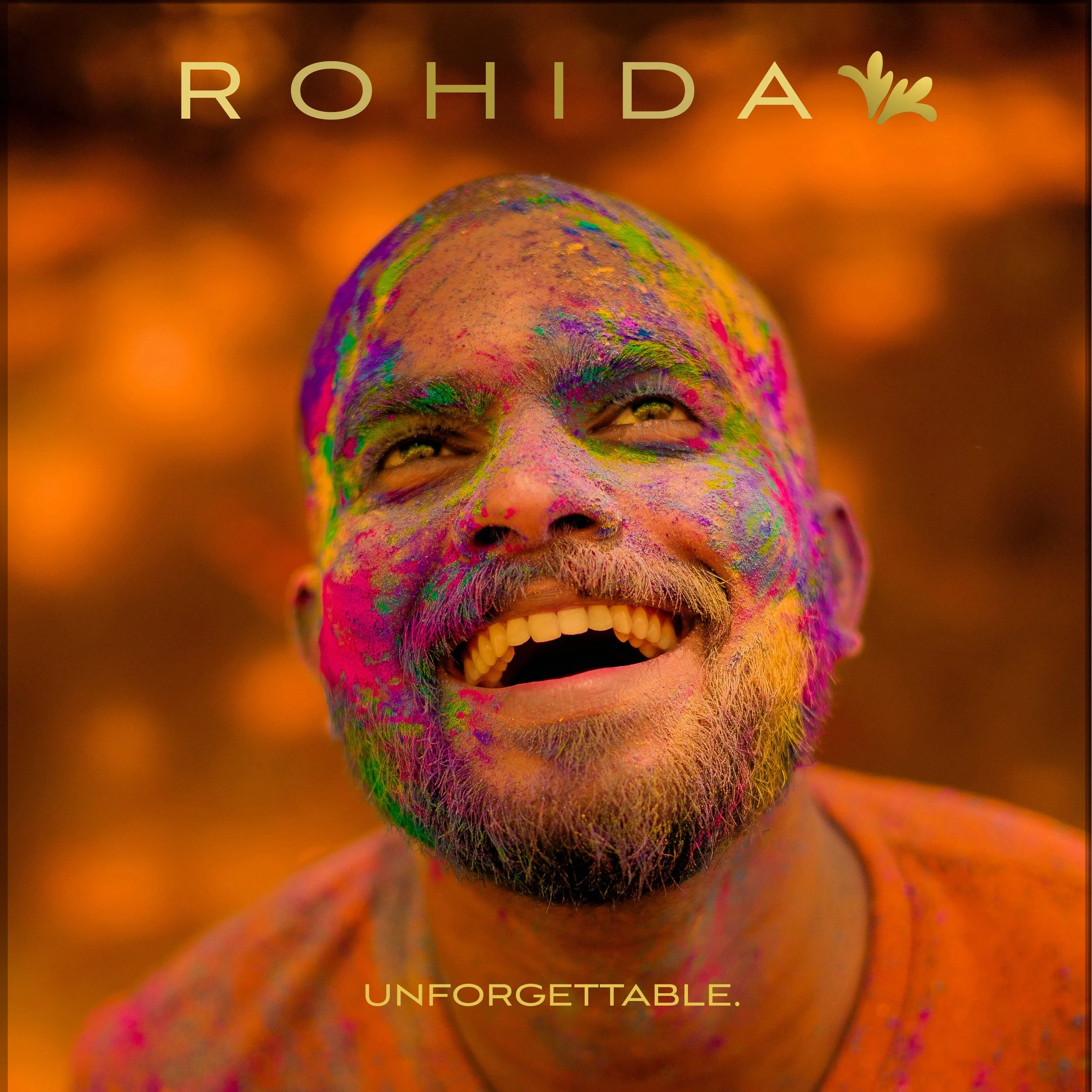
SOLUTION: The name Rohida was inspired by a unique, brightly-colored flower that is local to the area. The overall palette was drawn from the dominant colors of the environs, with accents of gold giving a touch of luxury. The vivid nature of the colors was selected to match the demographic’s desire for vivid experiences and also to help the brand stand out from competitors.
SKILLS: Art Direction, Ideation, Copywriting, Brand Strategy, Identity, Typography & Layout, Print Design, InDesign, Photoshop, and Illustrator.


*This work was produced as a student project for Shillington’s Online Graphic Design Course.
