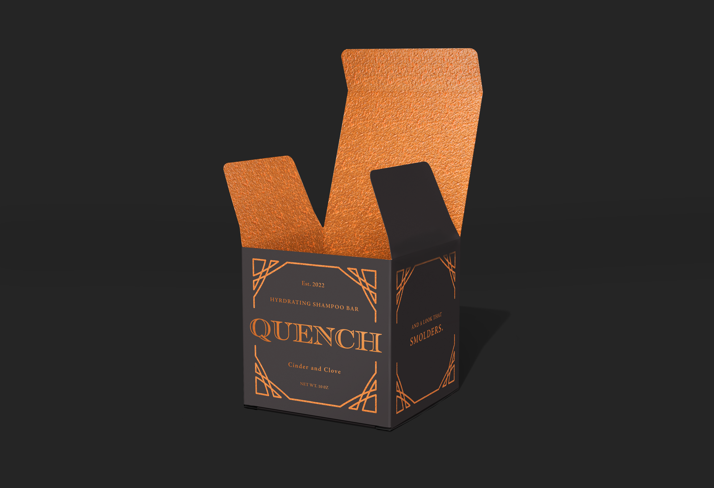
CHALLENGE: Design boutique-style packaging for an unusual target audience (blacksmiths) and an unlikely product (hair care).
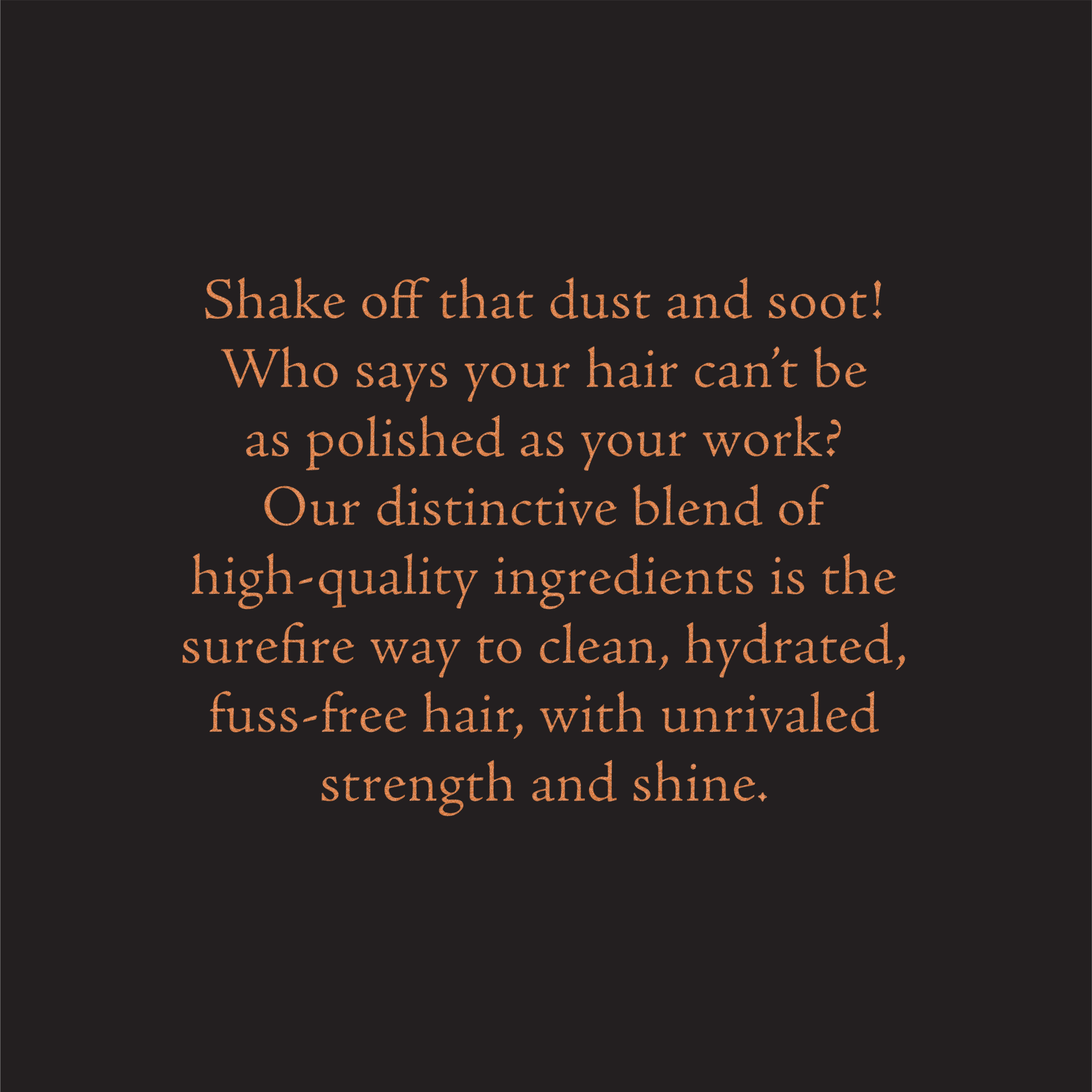
SOLUTION: I chose the name quench for its double meaning, referencing both the smithing term of cooling metal and also the idea of hair hydration. I selected the visual keywords artisinal, polished, and bold. My design was inspired by the shapes and strong lines of ironwork fences and some of the metals with which blacksmiths work. The copy and scent names were also designed to evoke images of fire, an integral part of the smithing process.
SKILLS: Art Direction, Ideation, Copywriting, Brand Strategy, Identity, Typography & Layout, Print Design, Packaging, InDesign, Photoshop, and Illustrator.


*This work was produced as a student project for Shillington’s Online Graphic Design Course.
